Browser Testing – All Email Clients are NOT Created Equal
Jill GuestEven a novice email marketer knows how critical testing is to their success. But when we think of testing, what comes to mind is typically an A/B or multivariate test, designed to give the marketer insight into what subject line, from address, or call to action most resonates with their recipient. This type of testing is critical, certainly, but an all-too-often overlooked type of test is browser testing.
In this post, I’ll cover some top tips for testing your email across browsers, clients, and devices, and how you should implement them.
Tips for Successful Browser Testing
- Test your campaign before every send. Sometimes making minor tweaks in your email editor can have major downstream effects in your email HTML.
- Be mindful when using personalization—most email marketing tools will allow you to insert substitution tags into your message so your recipient gets a message unique to them. While this is becoming a best practice, be sure to see how this substituted content looks across different viewing experiences. If the content varies too greatly in length or size, it could get truncated by certain email clients.
- Know the breakdown of devices, clients, and browsers favored by your recipients. (If you’re a SendGrid customer, our advanced statistics reporting shares this information with you.) This will help you prioritize elements of your email design. You should also keep in mind that these statistics will change over time. For example, at SendGrid we’ve learned that more emails are opened on an Apple device than any other device or platform. If you’re focusing your efforts on designing email for desktops only, you’re missing out on creating a great experience for those mobile users! You should continually examine how your emails are being consumed so you can deliver the best experience for the most recipients.
How to Test
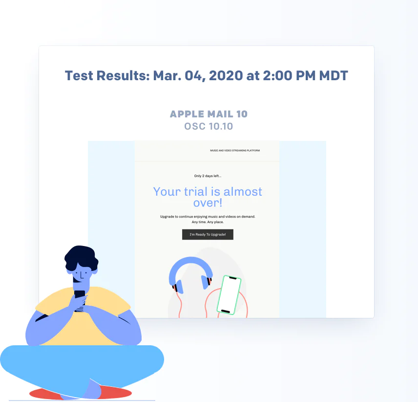
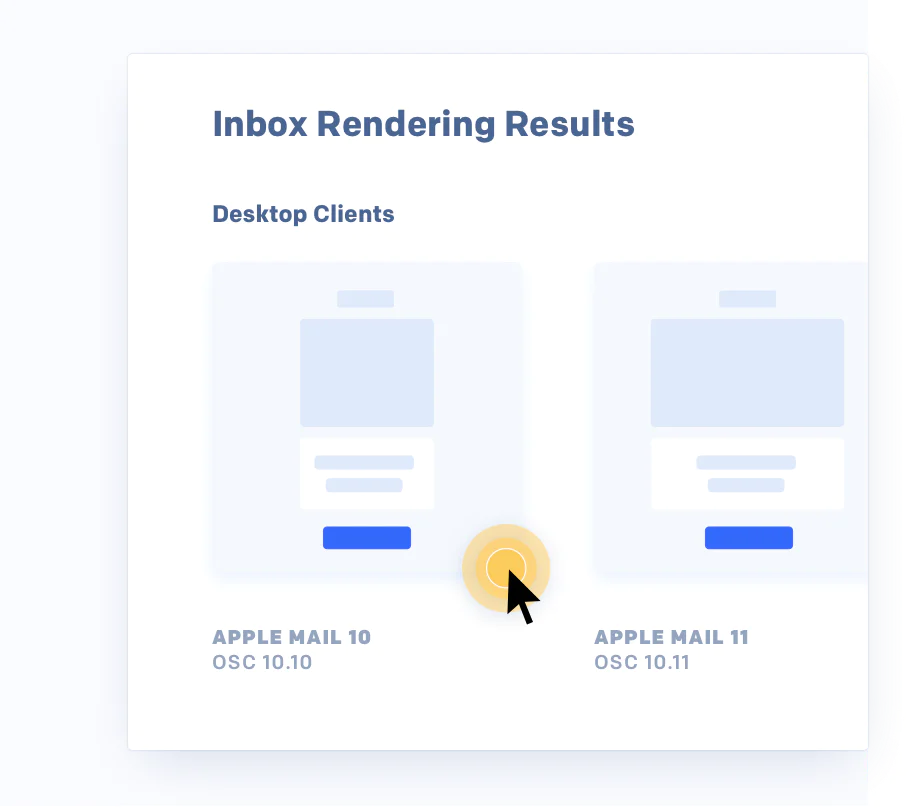
While looking at a sample email on your iPhone, desktop, and tablet is a great first step, we recommend utilizing tools like Litmus or Email on Acid that will enable you to quickly see how you message renders on dozens of combinations of devices and clients.
What to watch out for:
- Fonts – It’s tempting to get really creative with new or unique fonts in your email, but be aware that these may not be compatible with some email clients. It’s important to learn which fonts translate well across email providers, as well as designate a default font.
- Images – Even in this age of image-heavy email, some email clients either don’t support images, or disable them by default. Make sure you know what an imageless version of your email will look like, and don’t forget to add ALT text!
- Text formatting – Even if you’re running a graphically slim email campaign, testing will also reveal inconsistencies in your text formatting, like odd alignment, unwanted indentations, and line breaks.
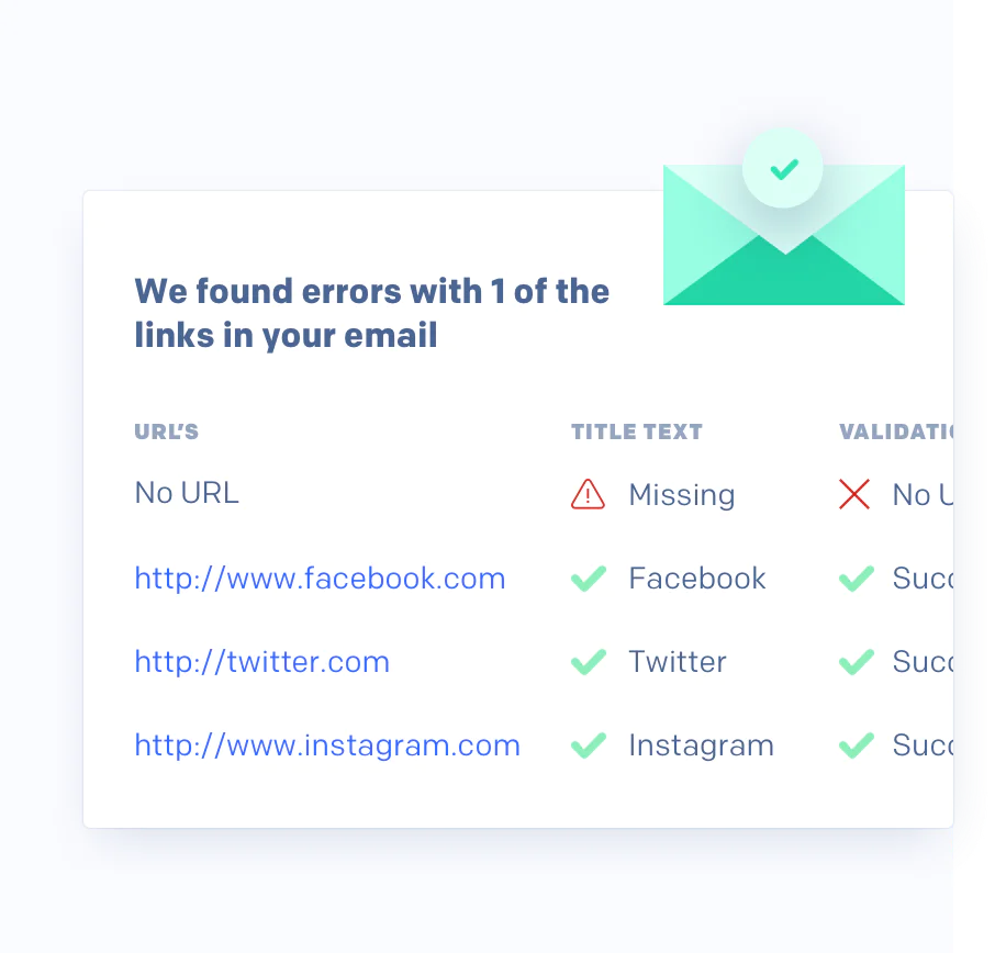
- Link tracking – If you (or your ESP) add link tracking to images or CTAs in your email, be careful that they don’t bloat your email size too much. Gmail has been known to “clip” emails that exceed a certain size.
What happens if you don’t test?
- Your recipients unsubscribe. Why should they continue to give their attention to an email that’s cumbersome and difficult to read?
- It hurts your credibility—lack of quality control negatively impacts your brand.
- You break the cardinal rule of email marketing: putting your recipients first.
The bottom line is this: email marketers should embrace the age of responsive design and designing for a mobile experience, and not be intimidated by the myriad of challenges that come with making that email look excellent for all their recipients. As long as you always test your email across browsers, email clients, and devices, and understand how your customers want to receive your messages, you’ll be set up for success!