Welcome Email Series Template (2/2)
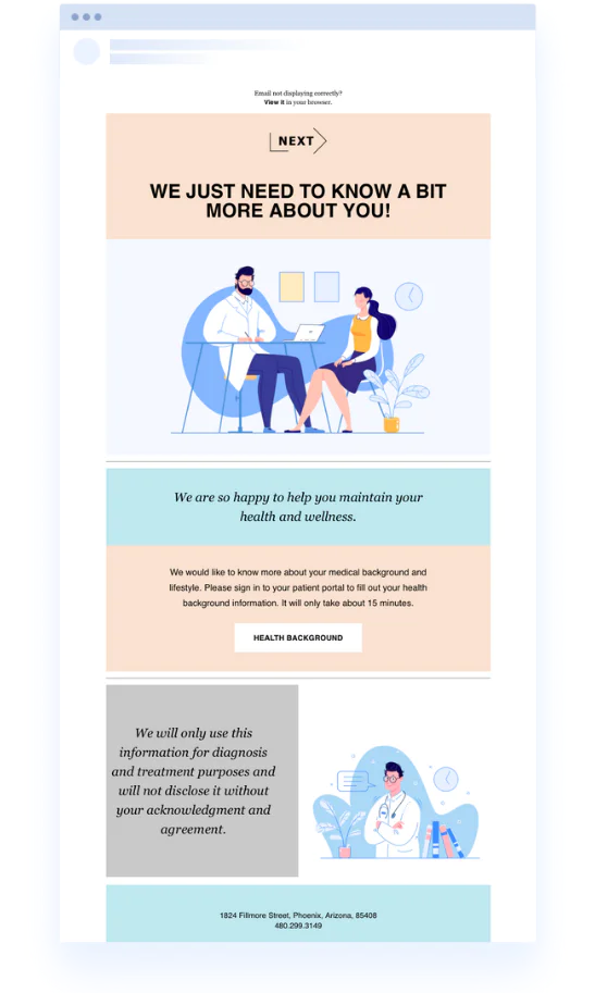
Just because you send healthcare messages doesn’t mean the messages can’t have personality. Keep your newsletter simple and on-brand with this basic, color-filled patient welcome email series template.
This template contains the perfect balance between text and imagery, allowing you to communicate your message with natural breaks throughout. Change the background colors of the text boxes to match your brand and make your email consistent. Keep the colors contrasting to improve legibility.
Need additional content blocks? Checkerboard the current format to build off of the design. This flexibility lets you expand on or dial back the length of your emails to suit your needs.
Welcome Email Series Tips & Tricks
Tip #1: Change the color of your text to ensure it’s legible within the boxes. For example, if you change a background color to black or dark gray, you’ll need to adjust your text to a lighter color or white.
Tip #2: Find illustrations or photography that match your background colors. This simple tip can help tie your entire email campaign together.


