Send With Confidence
Partner with the email service trusted by developers and marketers for time-savings, scalability, and delivery expertise.


Time to read: 6 minutes
Today, we’re diving into templates and how to use them with Twilio SendGrid’s flexible editor or adjust the HTML of the template in your email builder of choice. While some marketers may feel comfortable designing and coding a beautiful email from scratch, for those of us who aren’t web designers or email developers, email templates provide a powerful, time-saving way to craft beautifully responsive emails.
In this post, I’ll walk you through how to choose a pre-built email template and the design choices I make along the way.

If you’re starting in Marketing Campaigns, you have a variety of template options. But before you choose a template, ask yourself:
What is the purpose of the email you plan to send and the action you want your recipients to take?
Does this action require an explanation with a lot of text and a CTA, or are you trying to visually display your products with multiple images? Keep an eye out for structure and a format that will work well with your content.
Is your brand bold and loud, classy and quaint, modern and sleek? It's helpful to find a template that resembles your brand. While you can change images, text, and colors to match your brand, it helps to have a template that aligns with the style you’re looking to achieve.
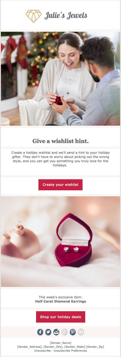
I chose the Ingrid and Anders Welcome Series 2 template on the left (available to download here) because I plan to send a promotional email from a jewelry store.
While the colors and images don’t represent the jewelry store’s brand, the boutique look fits the overall feel of the brand and the multiple images and sections of copy work well for the content I plan to send.

Here’s my step-by-step approach for getting from the template above to the email preview on the right while keeping the brand, message, and desired action in mind along the way.
I started by placing the jewelry store’s logo in the header. Your email recipients have shown that they trust and are interested in a relationship with your brand. Ensuring that what they see when they open your email is familiar and expected is critical to maintaining that trust.
img class attribute. The link should be placed in the src attribute (see below). Don’t forget to include the quotation marks around the link.img class and src attribute when switching out the images in the template. To include alt text, add the alt attribute to the img class and describe your image. To add a link to your image, include the href attribute within the img class tag. Step 3: Font
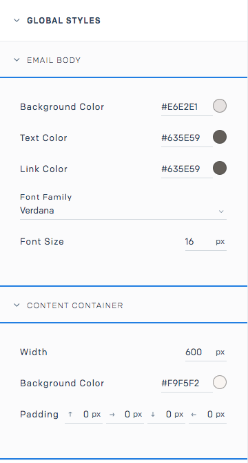
style, span style, background-color, bgcolor, color, and border-color. It’s likely that your template will have multiple attributes for the same color to be able to communicate the color to all email providers. Be sure to change all sections that list the color. Check out this example of the CTA button design and code. 
Once you have your email set up, test it by sending a preview to yourself. Here are a few things to check in your preview:
In Marketing Campaigns, you can also A/B test different elements (see image below), and see if a plain text link helps engage more clicks than a colorful CTA button. This will give you data to back up your design choices for future sends. For a full list of items to review before sending your email, look through Your Pre-send Email Testing Checklist.

Prebuilt templates are a great time-saving solution for those of us who aren’t email design and development experts. It’s easy to customize these templates to reflect your company’s brand and message without needing to get into the weeds of the email HTML.
For dozens of customizable, responsive templates sign up for a free Marketing Campaigns account.
Partner with the email service trusted by developers and marketers for time-savings, scalability, and delivery expertise.
| <img class="max-width" border="0" | |
| style="display:block; color:#000000; text-decoration:none; | |
| font-family:Helvetica, arial, sans-serif; font-size:16px; | |
| max-width:50% !important; width:50%; height:auto !important;" | |
| src="https://sendgrid.com/wp-content/uploads/2019/06/ialogo.jpg" | |
| alt="Ingrid & Anders" width="300" data-responsive="true"> |
| <a style="background-color:#b51934; border:1px solid #333333; | |
| border-color:#b51934; border-radius:0px;border-width:1px; | |
| color:#ffffff;display:inline-block; | |
| font-family:verdana,geneva,sans-serif;font-size:16px; | |
| font-weight:bold;letter-spacing:1px;line-height:30px; | |
| padding:012px 20px 12px 20px;text-align:center; text-decoration:none" | |
| href="https://juliesjewels.com/wishlist/" target="_blank">Create Your Wishlist</a> |