THE EXPERT’S GUIDE FOR EMAIL DESIGN
Chapter 1: Introduction
In this guide, we hand the mic to 4 of our customers who are excelling in their email design. You’ll find examples of their emails and templates, tips, and recommendations for what they’ve learned along the way. The companies range from an art technology company to a travel app, showing the variety of email design solutions across industries. Here’s a preview:
Artlogic talks about the first glance and going mobile.
Bonusly shares their GIF and call-to-action (CTA) strategy.
Hive Music designs clean templates with bold colors.
StaffTraveler stays in the lines of General Data Protection Regulation (GDPR) while driving brand recognition.
Twilio SendGrid’s template plays with color stories and fun fonts.
Use this guide to see what brands like yours are up to in their email design while also gathering helpful tips and design knowledge that you can take with you in your email design adventures.
Chapter 2: Artlogic achieves the simple and sophisticated
Artlogic strips their email down to the basics with clean lines and crisp images. As you read through Artlogic’s take on email design consider how you can keep the heart of your brand in your emails while maintaining a simple and easy to view design across platforms.

ASK THE EXPERT:
David Castle, Senior Web Designer at Artlogic
About the company: Artlogic is an international art technology company that works with galleries, artists, and collectors to create websites, inventory management systems, and apps.
Expert bio: David Castle is the Senior Web Designer at Artlogic in London, building websites and email for the world’s top art galleries and artists.
Email Walkthrough
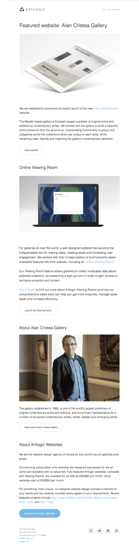
Artlogic’s emails promote the launch of the websites they build. The emails focus on the design of the websites, with the websites usually being the main focus of the imagery.
The first visual
Artlogic’s first visual is always an animated GIF, often showing the dynamic animations included in the website. This works well to grab the recipient’s attention as emails have a matter of seconds to persuade the reader to engage rather than delete the email.
Optimizing for mobile
In recent years, the volume of email read on mobile devices has greatly increased (according to Twilio SendGrid’s research, an average of 55.6% of email across industries is opened on a mobile device). More than ever, David needed to focus on getting the message across as quickly and efficiently as possible to adapt to the smaller screen size. He found that following a complex website layout is much less important than a clear, responsive layout that everyone can easily read on their mobile devices.
David then tested the mobile-responsive layout modules and templates using Litmus, a platform that (among other things) allows you to test how your email will look across email service providers (ESPs) before you send it.
Lessons learned in email design
Previously, Artlogic designed their emails to look almost identical to their website, trying to recreate complex, pixel-perfect pages. This proved to be extremely complicated as not all email platforms support basic elements of HTML and CSS. Years of building email templates taught David to work within the limitations of the medium–rather than fighting against it. This meant stripping back the complexity and following tried and tested methods.
“Ultimately, the key to designing a good email is in the detail of the content and clarity of the message: when it comes to design, less is certainly more.”
Takeaway
When considering your email design, don’t get too wrapped up in the design of a beautiful, but complicated, email. Learn from Artlogic by recognizing that simple, readable designs are much better than an email that doesn’t render well across providers. For more tips on how to optimize your emails for mobile, read our article on optimizing your emails for smarter sending.
Chapter 3: Bonusly’s GIF game is top-notch
Bonusly’s email design stood out to us for their bright, cheerful colors that matched their brand, their fun GIFs that catch your eye, and their use of multiple calls to action (CTAs). While this fun style will not work for all brands, Bonusly can certainly speak to trying and testing new ideas in their email campaigns.

ASK THE EXPERT:
Mark Peck, Product Designer at Bonusly
About the Company: Bonusly is a fun, personal employee recognition and rewards program that helps companies enrich company culture and improve employee engagement by celebrating achievements, milestones, and excellent work.
Expert Bio: Bonusly’s team is small (but mighty), so Mark helps across many different areas. His primary focus is to make Bonusly’s product a more delightful experience for its customers.
Email Walkthrough
This email is sent to users at the start of every month to encourage them to give bonuses to their teammates. One clear CTA is positioned at the top of the email with additional bonuses and CTAs in the remainder of the email.
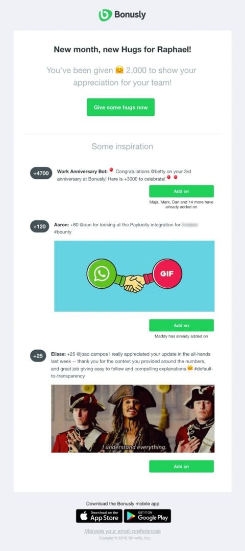
GIFs engage
Mark found that richer, dynamic information (i.e. the Pirates of the Caribbean GIF in this email) creates more compelling reasons for users to click through to their app. GIFs can be very fun for the right brand, and don’t have to be so far-fetched. You can create a GIF of your website or demo your product (see Artlogic’s example above) to inform and engage your recipients.
Multiple CTA strategy
In most of Bonusly’s emails, they try to stick to only one CTA to give the user a clear path to action, but in this case, the different prompted actions are so closely related that they all meet the email’s goal of encouraging the user to give a bonus. In this email, Mark wanted to test if adding the “Some Inspiration” section would engage users and prompt them to action, rather than confuse them by taking away from the initial CTA. The additional CTAs led to an increase in users going to the app to give bonuses.
QUOTE:
“The key to Bonusly’s brand is creating simple and delightful experiences. When it comes to email, it’s important to us that we don’t overload our users with content, but include exactly what is needed, and make it a little fun.”
Mark Peck
Takeaway
Mark’s experience with CTAs is a great reminder that there isn’t just one way to create emails. In fact, we should all be testing different elements of our email design to see if something like multiple CTAs, quirky GIFs, or CTAs above the fold will make a difference in our engagement rates. Use these additional design tips to boost your engagement rates.
BEST PRACTICE TIP:
Place your CTA above the fold.
If recipients can’t see that there’s something to click until they scroll, a lot of them will click out of the email before they see the link. We found this when we tested an email with longer copy and a CTA further down against an email that had shorter copy and the CTA above the fold. We saw a significant lift in engagement for the email that positioned the CTA higher up. - Austin Whiting, Email Marketing Associate at Twilio SendGrid
Chapter 4: Hive Music plays with bold colors and clean designs
Hive Music’s template speaks to how simple an email can be while still being beautiful! The clean layout, quick copy, and bold CTA quickly inform you of the purpose of the email (which, if you don’t read Italian, is to sign up for classes).

ASK THE EXPERT:
Giovanbattista Amato, Head of Technology and Marketing at Hive Music
About the Company: Hive Music is an Italian nonprofit organization aiming to promote and boost the territorial, cultural, and artistic development with classes, music, social events, and activities. It has a full music academy in Naples with a complete training program that includes courses and specializations for any level. Hive Music is part of the larger Hive brand, which will eventually include Hive Digital and more sub-brands.
Expert Bio: At Hive Music, Giovanbattista leads a team that has created Hive Music’s brand and identity, websites, and digital services.
Email Walkthrough
The goal of Hive Music’s email design was to create a simple-to-read but attractive template. It needed to be beautiful and colorful enough to catch the reader’s attention while also informing students that registration for classes is open.
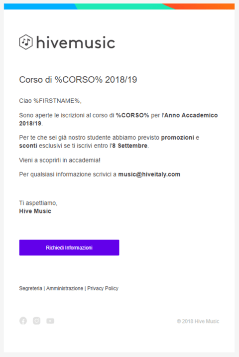
Bold colors
Giovanbattista used a grey background and a white main container to help focus the reader’s attention on the lighter center area. Because the logo featured here is black and white, he added vibrant colors in the form of a colored header and CTA to help the email pop.
Testing
Giovanbattista conducted tests for various email providers and email clients. He tested the use of SVG, a vector image that improves the quality of logos and other elements while also reducing the size of media files (a great benefit for mobile devices and users). Unfortunately, he had to revert to PNG and JPG, as SVG is not currently supported by the majority of email clients. Another element he tested was the use of CSS inside <style> elements. In this case, the style elements were accepted, specifically if the element was placed in the <head>.
Consistency across sub-brands
The email template was designed for the entire Hive ecosystem and can be easily adapted to any of the sub-brands. Each sub-brand has its own color scheme, which can then be displayed in the email by changing the header, logo, and CTA colors. This cohesiveness among sub-brands helps drive connection and increase engagement for the Hive ecosystem.
“We conducted A/B tests on the colors/media types used, and obviously, colors and animated media bring more engagement and interaction.”
Takeaway
Having a neutral base, like a light gray or light tan, is a great way to begin your email design. This neutral background color (unlike a dark background color) allows you to include pops of color throughout the email without overwhelming your recipients. You’ll want your CTA to be the boldest color, but pay special attention to the contrast of the text to the CTA background color. The contrast should be high enough that the text is easily legible.
To ensure that the color, text, and general formatting is consistent across platforms, follow Giovanbattista’s lead by testing your email before you send it. Use platforms like Email on Acid, and these 10 Tips for Designing and Developing Emails to help your emails look great across all email providers.
Chapter 5: StaffTraveler flies high with easy unsubscribe options
Two elements of StaffTraveler’s email stand out in particular: the branded illustrations and the “Do not email me again” link underneath the first call-to-action. This startup is making bold moves in the airline industry and their email design!

ASK THE EXPERT:
Laurens Maars chalkerweerd, Co-founder of StaffTraveler
About the Company: StaffTraveler enables airline employees around the world to help each other get flight loads (the number of available seats) they need. Members can also share their favorite hotspots in the app and book heavily discounted hotel rooms and rental cars. StaffTraveler has over 120,000 members from all airlines with a 4.8-star rating in the App Store.
Expert bio: After flight training, Laurens joined Transavia as a pilot in 2008 at age 22. In 2015, Laurens founded StaffTraveler with a colleague, trying to solve the problem of the uncertainty of getting on a staff travel flight. The idea was born when Laurens’ colleague was stuck in an airport in Asia for a couple of days.
Email Walkthrough
This email announces the upcoming launch of the new StaffTraveler app with improvements for iOS and Android, breaking out the updates in easy-to-read sections with fun illustrations that pull your attention all the way to the bottom of the email.
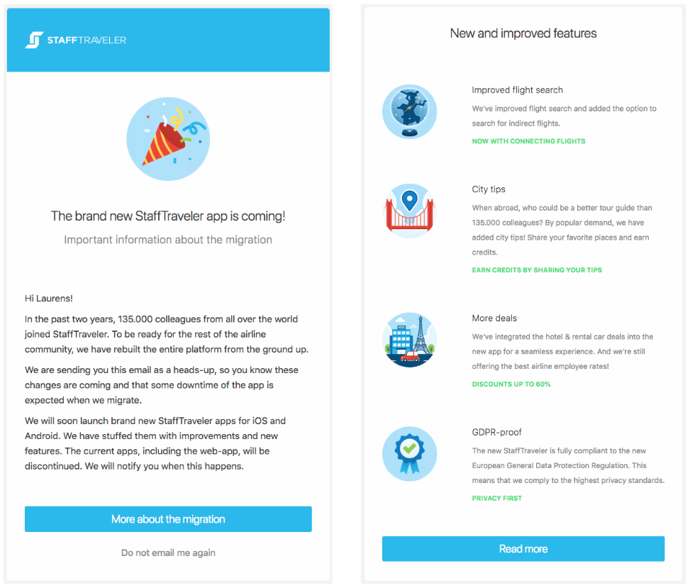
Branded illustrations

Laurens wanted their emails to be more than a message, but also a reminder of their brand. They incorporated branded images into the emails to create brand recognition and give their brand more of a personality.
One of their most popular illustrations is a smiling suitcase (featured to the right). This illustration has become the mascot of their brand with enough demand for this illustration that StaffTraveler now sells it as a sticker!
Do not email me again button
Generally, you’ll see an unsubscribe button at the very bottom of an email in fine print. Due to the recent implementation of GDPR, Laurens wanted to give the button more visibility and make it as easy as possible for recipients to unsubscribe. They added the button below the first CTA of the email to make sure their recipients knew they could opt-out of StaffTraveler emails.
“I wanted to make it very clear that recipients can opt-out of our emails. This helps keep our list clean and makes it less likely that recipients will mark our emails as spam, which affects our delivery rates.”
Takeaway
An unsubscribe button may not feel like a design choice, but really any element of your email is influenced by design. From unsubscribe button placement to font size, it’s important to be intentional in your email creation. While it might seem counterintuitive to place your unsubscribe button so far up in the email, in Laurens’ experience it helps keep the list clean. This helps ensure that you have engaged recipients who won’t be flagging your email as spam. For additional unsubscribe recommendations, check out our article Unsubscribe Email Best Practices and Email List Management.
Chapter 6: Twilio SendGrid’s email marketing template seeks adventure
In addition to our customers’ beautiful emails, we want to highlight an email that our Sr. Web Designer, Corinne Nagel, created for an email template in our Marketing Campaigns platform. This template is one of many that Twilio SendGrid’s customers can use and adapt for their email marketing campaigns. Corinne based the template off a hypothetical travel company, Off Grid Adventures, incorporating bright colors, active images, and a fun font into this email design. Here are a few of her email design tips and tricks.

ASK THE EXPERT:
Corinne Nagel, Sr. Web Designer at Twilio SendGrid
About the company: Twilio SendGrid makes it easy for developers and marketers to craft, segment, test, and successfully deliver all of their email.
Expert bio: As Sr. Web Designer, Corinne is responsible for crafting effective yet enjoyable digital experiences for the millions of visitors to the SendGrid.com website. She always has her eye out for exciting new design trends, and makes user experience and accessibility top priorities.
Weaving colors
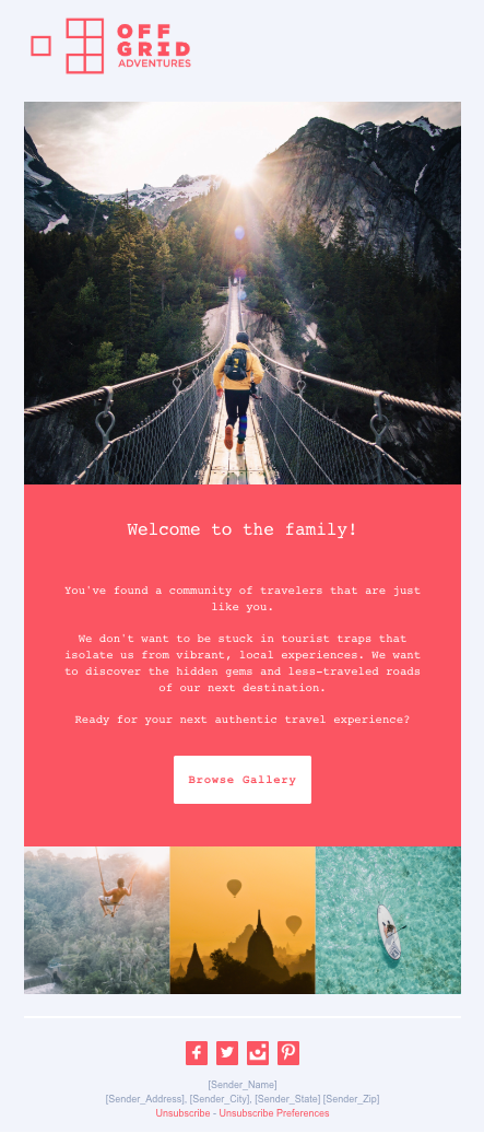
If you have multiple images in your email, Corinne recommends weaving colors throughout the images and email. For this template, she chose an image of a person running on the rope bridge in the mountains because it sparked feelings of excitement for adventure.
She then picked out the boldest color in the image, the yellow-orange jacket, as the color to highlight throughout the other images. She looked for images that either included the yellow-orange color or a complementary color (blue-green). Pulling photos that work together in a color story creates a cohesiveness to the email, and helps you narrow down the thousands of stock photo options you can choose from.
Fun fonts
In this template, Corinne uses a serif font (a font that has a stroke or line at the edges of each letter). Serif fonts tend to be funkier and less corporate, making it the perfect fit for an adventure/travel company. Whatever font you choose, Corinne recommends going for legibility and leaving the cursive, curly-q fonts behind. Lastly, have a backup font in place for those ESPs that only accept a few standard fonts.
Back to the brand
If you’re unsure what color scheme or font type to use, Corinne recommends circling it back to your brand and the purpose of your message. In this template, Corinne pulled the color of the logo into the main content blocks of the email. This coral color is probably too bright for a lot of brands, but it’s fun for a travel company and a great way to represent its brand throughout the email. Also, consider what information you’re trying to get across and how you want your recipients to feel when choosing colors. Colors can have a big effect on emotions and help create excitement (yellow) or calm (light blue).
BEST PRACTICE TIP:
When designing emails, reflect on your target persona.
At SendGrid, we are communicating with two very different personas, a developer and a marketer, so they respond to different visuals. In emails to developers we tend to not include as much imagery unless there’s detail in the image that adds information, such as an instructional or product-oriented GIF. For the marketing audience, a splash of color or stock photography that evokes emotions tends to perform better. Knowing your target persona will help you focus on what visuals to include in your emails. - Jill Guest, Sr. Customer Growth Marketing Manager at Twilio SendGrid
Takeaway
When designing your emails, take a step back and remind yourself of your brand, message, and target persona. Think about how you want your recipients to feel and how you want your brand to come across (e.g. professional expert, fun and light-hearted, or informational). Keeping the purpose of your communications in mind will help you stay consistent in your email design. For more design tips related to your company’s brand, check out our article, How to Maintain Brand Standards in Your Email Designs.
Chapter 7: Wrapping up with big picture themes
We hope these tips and tricks from email experts in different fields will help you develop and design beautiful emails that you can be proud of. To wrap up this guide, let’s review the most common themes from our interviews with our customers and our Twilio SendGrid team, and look ahead at a few email design elements on the horizon.
- Vivid visuals
Incorporate visuals that stand out in your emails and connect with your persona. From GIFs of website demos to bright purple CTAs and illustrations unique to your company, find the visuals that fit with your brand. Be sure to spice it up now and again by testing colors, fonts, and images.
- Testing 1-2-3
The best email designs evolve from a lot of trial and error—and trying to avoid as much of that error as possible in your recipients’ inboxes, it’s important to test your emails before you send them. Use tools like Email on Acid or Litmus to make sure your email renders correctly across platforms. This is important to your delivery and spam rate, as poorly designed emails are more likely to be marked as spam - K-I-S-S
Keep it simple, stupid! We’ve all found that it’s better to excel in simplicity than to overcomplicate emails and sacrifice how the emails displays across different providers. Learn from our mistakes, and don’t attempt to recreate your website in email form. Rather, pull elements from your brand, such as your brand colors and font, to help your email feel like an extension of your website.
- Looking forward
As ESPs continue to develop their systems, Twilio SendGrid’s email expert, Jill Guest, says to keep an eye out for more emoji support among mailbox providers, as well as interactive elements like carousel images or hover buttons. There’s a lot to look forward to in the email design world as ESPs and mailbox providers adapt and are able to do more personalization and interactivity in emails. Watch for ESP updates and the trends that follow, and subscribe to our blog for information on everything email.
Are you feeling inspired by these email marketers? Get started designing your email in our Marketing Campaigns platform. In Marketing Campaigns, you have the option to use our pre-built template with a visual drag-and-drop editor or you can code your emails from scratch. Sign up for a free account today!
Get Started with SendGrid
SendGrid helps you focus on your business without the cost and complexity of owning and maintaining an email infrastructure. And with a full-featured marketing email service that offers a flexible workflow, powerful list segmentation, and actionable analytics, all of your email needs are met in one simple platform.