Email Design Best Practices for 2019
by Kala Narayan, Visual Designer at Twilio SendGrid
by Kala Narayan, Visual Designer at Twilio SendGrid
It’s estimated that 281 billion emails were sent every day across the world in 2017. By 2023, that number is expected to reach 347 billion emails a day.
Yet most of those emails are never opened or read. Some are never even delivered. Many are sent to spam filters, and even more are deleted or ignored.
Why are some emails discarded while others are engaged with eagerly? What’s the difference? While subject lines and your email copy will play a large role, your email design greatly influences overall engagement.
To make the most of your email design, we’ve put together a guide that covers:
We can’t wait to see what you create!
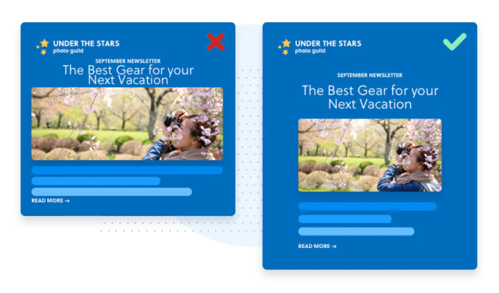
Well-designed emails allow for better interactivity and consumption. Users understand at a glance what the purpose of the email is. The buttons, links, and other calls to action (CTAs) are well-defined and obvious. Every element within the space serves a purpose that is meant to lead the user to your website, newsletter, etc.
The colors and fonts are accessible to people with disabilities, as well as people reading on tablets and mobile devices. The email content is presented in a visually appealing way that retains viewer engagement and serves the purpose of the content (e.g. a confirmation notice is short and direct, whereas a promotional message for an ecommerce brand has multiple images and buttons).
So how can you make sure your email is one of the few that stands out among the hundreds (or thousands!) that land in inboxes every day? We put together some examples we love as well as guidance on how to design great emails.
Examples usually make it easier to understand visual concepts, so let’s go over 3 brands that practice great email design.
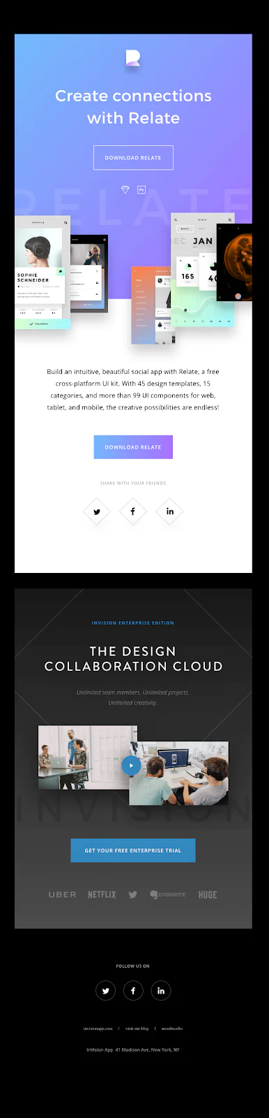
Invision’s email showcases how you can play with the structure of text and images if you use clean typography and accessible colors. Their color choices are striking, yet easy on the eyes. Plus, the overall black background makes the blue-purple gradient pop.
The large heading at the top gets to the point of the email and has two CTAs: one at the very top so people don’t have to scroll and read the whole message before downloading and another CTA below the visuals and description. The second CTA makes it easy for users to click without having to scroll back to the top.
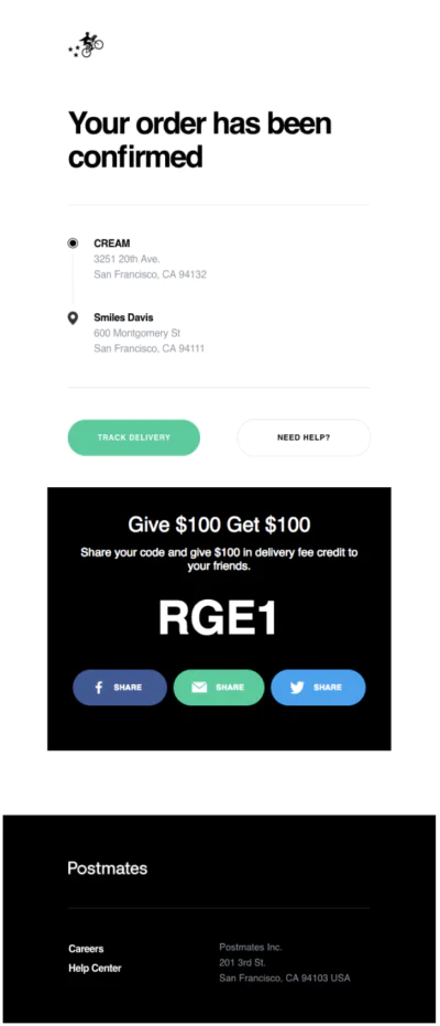
Postmates solidifies its brand identity by starting with the Postmates logo and a large, bold headline that states the purpose of the email, “Your order has been confirmed.”
Because the goal of the email is to inform users of their order confirmation, the simplicity of the design works particularly well and demonstrates a good use of white space.
The message is also a good example of the importance of hierarchy. In visual design, hierarchy means putting the most important content and design elements at the top. Imagine if Postmates had arranged the content in a different order, like including the promotional share code at the top of the email instead of the bottom. Users wouldn’t immediately know that this is their confirmation email until they scroll.
Emails from Herschel are always playful. Each email has its own theme that falls within the brand’s color palette. The product shots are professional and perfect to the pixel.
In this email, the images are cropped in different ratios and layered over each other. The large, bold CTAs make it easy for subscribers to shop the sale and the typography and layout are unique.
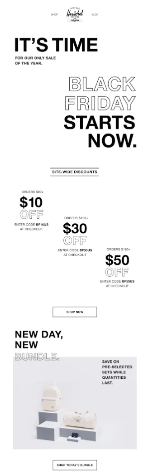
Because the content is left aligned, Herschel doesn’t sacrifice readability while using an unexpected layout. With the typography, the filled-in versus outline-only styling adds even more visual interest.
For more great examples to inspire your email design, read our guide, The Expert’s Guide for Email Design.
Now that you’ve seen a handful of examples of emails that demonstrate great design, it’s time to learn how you can create beautiful emails. If you follow best practices and design tips, you’ll be well on your way to making interesting emails that your subscribers love.
Design your email before you start building. If you have design software and feel comfortable using it, that’s a great place to start, but paper and pencil work just fine too.
Plan out where the images, body copy, and CTAs will go before you start building the email. Then, it becomes even easier to put it all together in your email service provider’s editor.
The design process is much faster process when you have access to your company logo, brand colors, approved images, and fonts. Create a folder that has all of these items to make the process as seamless as possible.
This allows you to explore how it looks with different background colors. You should also experiment with the placement of the logo to see if it looks better left aligned or centered at the top.
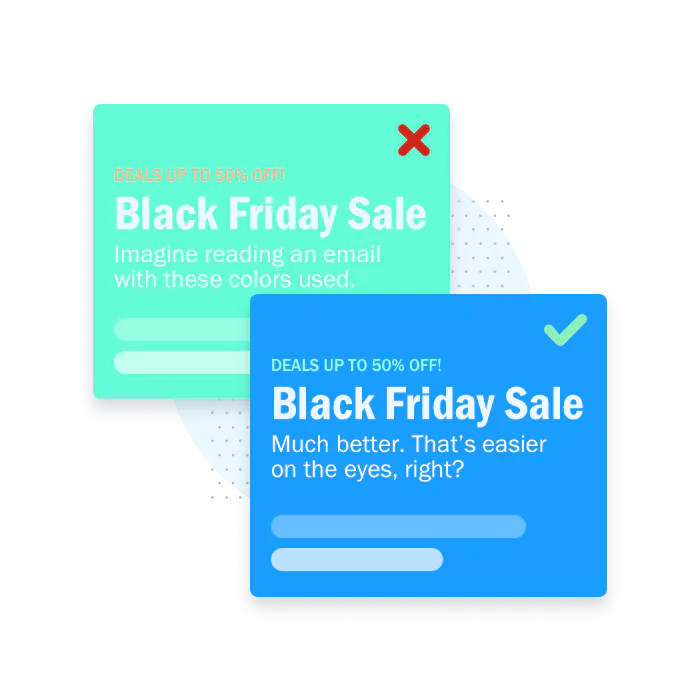
A lime green or bright yellow may look great in your logo, but how will it look as the background of an email? Probably not great.
Instead, consider using bold colors in smaller sections of the email such as in buttons, links, icons, or other small elements. For example, one of IDEO’s brand colors is yellow, but they use it sparingly as a top border, footer, and as a button background color.
It’s also important to consider colors from an accessibility standpoint. Those who are color blind may not be able to see holiday emails that combine red and green. For more accessibility design tips, check out our article, Email Accessibility Design Best Practices.
Use a font that’s easy to read and looks great when it’s reduced to a smaller size, such as when used as body copy. Fonts such as Helvetica, Arial, Proxima Nova, Lato, and Open Sans read well no matter what size they are viewed in.
It’s okay if the email body font differs from your logo font. In most cases, it’s advisable. For example, The New York Times has an iconic, well-known font in their logo, but imagine reading an entire email in that logo font. The content would be harder to read, especially on small devices.
In emails, your logo should be one of the very first things someone sees. This tells the recipient right away who the email came from and it establishes a sense of brand awareness.
Then, you can add a headline or an H1 to act as a title followed by a subtitle or blurb to expand on the H1 or title of the email. Together, these should tell the user everything they need to know at the beginning of the email and give them a reason to read the rest of the content.
Images capture attention. They provide engaging visuals for your emails, but you should only use high-quality images in your content.
How can you tell if an image is high quality? It will have sharpness, proper color balance and contrast, no pixelation or blurriness, and no distortion. That being said, there are caveats. If your brand supports grainy, film-style images, then choose content that fits your visual identity.
To make sure your email meets accessibility standards, it's important to provide written descriptions of images. This makes it much easier for those who are visually impaired to listen to and understand the message of your email.
To find images for your email campaigns, see if your company has approved photography or product shots. If not, check out our favorite non-stock photo options.
As we saw in the Herschel email example above, layering can help you save space and shorten the length of your email. Take a look at some additional examples in our Email Template Gallery to see how this looks in action.
Another way to approach layering is adding text on top of an image or layering several images to create a single image. If you do this, be sure the background is transparent (save it out as a .png image) or use the same background color you plan to use for the email. (Not sure how to layer text? These design tools will help you easily create visual content.)
GIFs are a fun way to convey emotion that may be hard to completely express in static images. They are also shorter in length and file size compared to videos. That’s a great combo for load times and keeping your readers’ attention.
To make a GIF, use video footage of your email content or rotate several images. Just make sure the speed and timing of the GIF isn’t too fast and the file size isn’t too large to ensure the image loads even when opened on devices with slower data speeds. Need a gif-making tutorial? We’ve got you covered.

Use bold colors and obvious buttons or text links in your designs for higher engagement rates. Buttons are usually more obvious across smaller devices but text links work when multiple CTAs need to be added in a certain section. Try A/B testing different button colors or buttons vs. links to see what receives the most engagement.
Don’t forget to edit the color of the links you include! Links often default to blue when delivered to inboxes and this can be hard to read if you use a dark background color (such as black or dark blue). You can avoid this by changing them to a color that will show up in your design.
In visual design, negative space is the open space between the different content elements in your email (images, paragraphs, buttons, etc.) that provides breathing room between sections. It’s important for the readability of your email, especially within smaller screens.
If you leave negative space between the body copy and images of your email, it will be much easier to read and it won’t look too crunched.
There’s no need to build emails from scratch for every send. You can save your most successful designs as email templates that you can reuse for similar messages. By creating a template, you can easily replace text and images while keeping the logo, colors, and certain sections (such as the footer) the same to save time and get users familiar with your brand.
That’s not to say you should use the same template for every send. In fact, it’s helpful to have a few templates on hand for the kinds of messages you typically send, like promotional emails, newsletters, or transactional emails.
A footer that contains important links on your website can direct recipients to pages they’re interested in, such as product pages for ecommerce companies or additional resources for software brands.
Footers are also an opportunity to include an unsubscribe link in an easy-to-find spot so recipients can easily update their communication preferences.
So far we’ve focused on the creation of emails, but there’s more to the design process than building the email.
A big portion of design work goes toward ensuring the email is functional across email clients (Gmail, Yahoo, Outlook etc.) and responsive across devices.
On some email providers, a button with round edges may show up as a rectangle instead. Your fancy Google font may be reverted to a generic font such as Times New Roman. It depends if you’re okay with how these changes look or if it changes your overall design too much. The biggest thing to look out for is broken links or cut off text—now that would negatively affect the content and design!
This will ensure that your email fits the screen size for all email service providers.
For more email development tips check out our article, 10 Tips for Designing and Developing HTML Emails.
Since email providers may present your emails differently than you designed, it’s important to know what the delivered version of your email looks like before you press send.
To see how your emails look before you send them, try using the Email Testing feature in Marketing Campaigns. Preview how emails will appear in inboxes across providers, check that all of your links function correctly, and determine the likelihood of ending up in the spam folder with our Email Testing tool (available in the product UI).

If you don’t want to use an email testing tool, you could also send a test email to yourself and other teammates. Try sending it to people with various types of devices and email providers to be as thorough as possible.
If you put these guidelines and tips to practice, you’ll be well on your way to creating emails that stand out in the inbox. Keep in mind that practice makes perfect. Continue to test your emails to understand what works with your audience and what doesn’t—it’s all about finding a good balance of what is successful for your email program.
Plus, with Twilio SendGrid Marketing Campaigns, it couldn’t be easier to design beautiful emails. Between the pre-created templates, easy-to-use editors, and Email Testing tool, you have everything you need to create and send well-designed emails.
SendGrid helps you focus on your business without the cost and complexity of owning and maintaining an email infrastructure. And with a full-featured marketing email service that offers a flexible workflow, powerful list segmentation, and actionable analytics, all of your email needs are met in one simple platform.