Your Guide to Email A/B Testing and Optimizing Your Call to Action
Thoughtful A/B testing and optimizing CTAs ensure that you’re listening to your recipients and continuously improving your email marketing efforts. This guide walks you through both important pieces so your email campaigns continue to get better and better.
Welcome
High converting email campaigns demand dedicated time, an appetite for experimentation, and commitment to nixing underperforming content. Although there are many variables that ultimately determine the success of your campaigns, performing A/B testing and enhancing your calls to action (CTAs) position your campaigns to truly resonate with your audience.
Testing various elements of your email campaigns illustrates which message or offer resonates best with your audience. This tactic should be a critical piece of your email marketing strategy because it leverages data over gut instinct. Recipients may think and react differently than we email marketers do, but you will never know for sure if you don’t test and measure your results.
Here are some things to think about when it comes to A/B testing your emails.
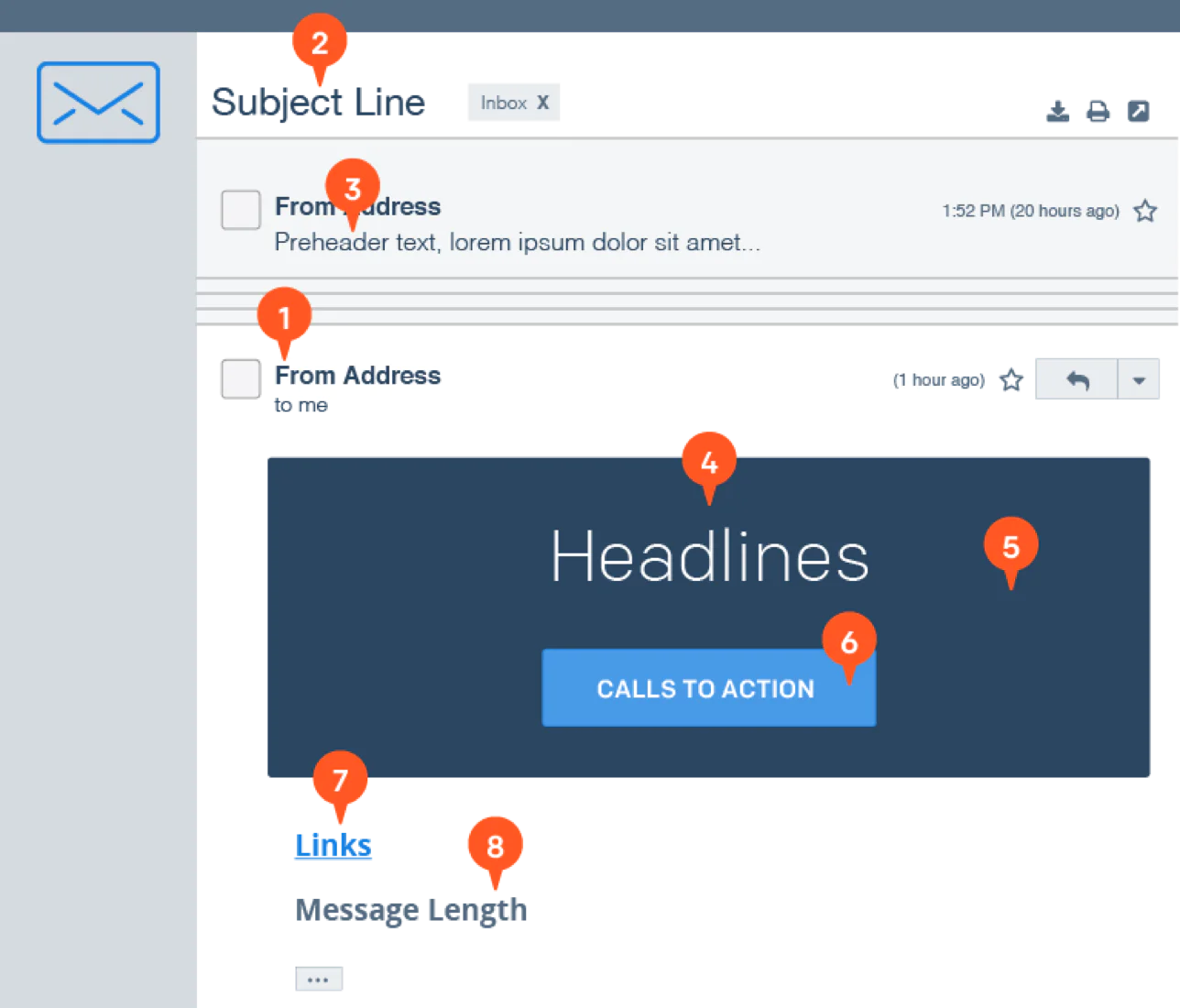
1. From Address: Be Friendly
The “From” address can be a great way to build a relationship with your users. Determine whether your emails should come from a person, your brand, or a combination of both, by comparing open rates from an A/B test. And once you have determined which one performs better, stay consistent so that you can continue to build trust with your user.
Here’s a clever from address that comes from a witty, high-personality digital marketing consultant and copywriter:
This tone may likely not suit your needs, so it’s always a great option to use your brand as your from address and keep it consistent.
And if you’d like to personalize a bit more and add a name you could always add a [first name] from [brand name] format like Invision does:
Here at SendGrid, we ran a test on our from address copy that included a) SendGrid vs. b) “Matt from SendGrid” and the second option garnered a 10% higher open rate than option A.
Best Practice Tip
Never send an email from a “no-reply” address. Doing so immediately creates a barrier between you and your subscriber. Your “From” address should invite communication–not deter it.
2. Subject Lines
As the first message users read as they decide to open your email, subject lines need to interest your recipients enough to drive that open. Test the word length of your subject line as well as the tone and voice.
For example, one might be lighter and creative and one might be more literal and straightforward. Our Big Data Team at SendGrid analyzed millions of email subject lines sent through SendGrid and found that 3 word subject lines resulted in higher engagement and open rates:
The Effect of Subject Line Length on Email Engagement Rates
21.2%
3 WORDS
15.8%
7 WORDS
The data for this study in 2015 resulted from analyzing 5 million unique subject headers in nearly 18 million emails.
Looking for more specific advice on writing subject lines? Check out Email Marketing Subject Lines: Dos and Don’ts.
Personalized subject lines (like using the recipient's first name) may also persuade a recipient to open your email. Play around with using a first name in a subject line and if you experience higher open rates, continue to do so. Emojis, while sometimes divisive and distracting, are certainly being used more and more. Depending on your industry and content, they may work for you.
3. Preheader Text: Take Advantage of This Space
The preheader text is the line of text that appears right after your subject line. This is an important piece of content because it’s another chance to convince your recipient to open your email. Take advantage of this real estate by testing different versions of preheader text.
Preheader text is the text that appears right after your subject line.
4. Headlines
Once a recipient has opened your email (nice work!) the headline is the first element they see. Make sure the headline within your email communicates the main message and stays consistent with the tone or theme of your subject line.
If you get creative in your subject line, mirror that creativity in your headline. Always make sure to maintain that balance because if your message is confused…so are your readers.
5. Images: Don’t Let Rendering Get You Down
The old adage, “A picture is worth a thousand words” rings true with email too. The right image selection can increase engagement with your recipients. Make sure your images reflect your message and your brand.
But images can also be problematic when it comes to email. Not all email readers automatically display images and photos render differently depending on device and browser settings. Add relevant copy to the alt tag of your image to encourage the image download from your users. Also consider using bulletproof images (screenshots of images) when placing them into your emails to ensure that they render properly.
Taking a screenshot of an image will help reduce the chances of the format changing too much. To take a screenshot, simply press Shift-Command-4 and use your mouse to hover over and click the area of the photo you would like to use.
Remember that too many images in an email will bloat the size of your email and may increase the chance of your email getting clipped (see section on links below to learn more). To avoid this, save your image at the minimum resolution needed or consider using a site like tinypng.com to reduce the size.
6. Calls to Action: Testing Is Your Friend
Since your CTA will ultimately drive your recipient’s response, make sure it works. Test buttons, links, wording, and colors. An effective CTA can exponentially increase your response rates.
Including too few or too many links can have a negative effect on your email campaigns. Try testing different versions of your emails with more and fewer links to see what the right ratio is for your campaigns.
If you see the image above in a test email, your entire email isn’t getting through to the inbox.
8. Message Length: Shorter Is Better
If you’re seeing that your recipients are clicking on the first link in your emails, then you can shorten your email. If they are scrolling to the bottom, try moving your link up to see if you can earn a faster response.
A 2017 Litmus study revealed that people spend an average of 11 seconds reading an email. While this time grew from previous years, the takeaway here is that shorter generally is better. If you’re receiving no clicks, you may need to shorten your message or include more link opportunities.
Test several templates, but stick with your winner, so that your emails maintain a consistent look and feel.
Your email template is a great place to test color palettes and secondary brand colors to see how your audience responds. Test several templates, but then stick with your winner, so that your emails maintain a consistent look and feel.
Images: Test Placement and Size
Equally as important as the prose you put on the page are the images you choose to complement it. These include photos, illustrations, borders, bars, and any non-textual elements in the email.
Have you re-visited the placement and usage of these elements in your emails lately? You may consider testing out a large hero image or placing smaller images next to each module.
Plain Text vs. HTML?
ISPs used to favor pure plain text, but as long as you have alt text on your images, your deliverability won’t be negatively affected. But this doesn’t mean you shouldn't test to see which version your recipients engage with more.
Test plain text emails against HTML emails. Or even consider incorporating both versions into your email so that it “looks like plain text” but is actually HTML—meaning that you use an HTML template, but strip down as much formatting as possible so that it appears as a personal 1:1 email.
As odd as it may seem, plain text emails need some designing too. Long links can be distracting to the text so formatting and editing is key. Keep an eye on the results of these tests as they may surprise you.
Timing elements to A/B test include time of day, day or week, and frequency.
To determine the best time of day to send your email, try sending your campaigns at different times in the day (i.e. morning vs. afternoon) to see when your open and click rates are highest. Here are some more time of day tests you could consider:
Lunch hour vs. 8am
Lunch hour vs. 4pm
8am vs. 4pm
Keep in mind that getting to the top of the inbox is a great way to increase the likelihood of your recipients seeing and subsequently opening your email. While there’s no way to identify the perfect time to send, consistent A/B testing will give you a good picture of when you should plan to send your email.
Day of Week
There is no perfect day of the week to send a marketing email that works for all senders. Response rates will vary across industry and by the day or week. For example, if you have an app or a B2C product, response rates may soar on the weekends when your users are more inclined to engage with your app. Find out what works best for your program by testing different days of the week, such as weekdays vs. weekends or Tuesday vs. Thursday.
Frequency: Watch Your Engagement Closely
Frequency should be determined by both the type of email communication you send (daily deals, weekly roundups, seasonal newsletters, etc.) and by your engagement rates. If your subscribers are opening and clicking, your frequency (and the relevance of your content) is likely healthy.
If you’re experiencing low engagement, perhaps you should scale back and reassess your content and sending frequency. Not sure if you’re overdoing it? Fighting Email Fatigue helps you identify if you’re sending frequency is too much and causing your engagement to dip.
How much variance do you need? A general level of certainty is 95%.
Successful A/B testing requires a large enough sample to gain a genuine understanding of how successful your campaign will be for your entire audience. The testing size will also vary depending on what element you are testing.
If you’re testing a visually large element of the email (one that everyone will see, such as the subject line), then you can perform a test with a smaller sample size. In contrast, the smaller number of recipients who will view an element, the bigger the sample size should be in order to gather most accurate test results. For example: if you’re only testing the color of a button, fewer recipients may view it. Therefore, a larger sample size should be used in order to get the most accurate results and reactions.
If you are working on a single campaign that you won’t be sending again, find the smallest possible sample group and once a winner is apparent, go with that version as soon as you can so you can apply the winning option.
How much variance do you need to determine whether you have a winner of an A/B test? A general level of certainty is 95%. Getdatadriven.com provides a great A/B significance test that we use when we run our email campaigns here at SendGrid to help us determine certainty in our testing results.
Have more questions about A/B testing? Check out Your Top A/B Testing Questions, Answered
If you’re testing a single campaign, focus on a sample. The number of recipients will depend on the size of your list and what you are trying to achieve. For instance, send a test to approximately 10% of your list, assuming that equals at least a couple thousand people.
Again, you want a large enough sample to get an accurate picture of success. Once you’ve determined the winning campaign, deploy that version to the rest of your list.
Perform a 50/50 Split
If you’re testing time sensitive offers, test different offers. Set up two versions of your email campaign and split your list in two. Make sure this split is done at random (done automatically in most ESPs and included in our email marketing solution, Marketing Campaigns) as you don’t want to skew your results. In this case, focus on conversions as your metric for success and use these results to determine your future offers.
Monitor Opens and Clicks
If you’re testing automated emails or transactional emails, focus on the results. Since the content in these emails remains consistent, you can focus more on response rates to test success.
A/B Testing Quiz
Test your knowledge of A/B testing by completing the quiz below before moving onto the Call to Action Section:
QUESTION:
You should test as many variables as possible during an A/B Test
YOUR ANSWER WAS CORRECT
Nice work!
Only test one variable at a time so that you know there are no other factors affecting your results.
YOUR ANSWER WAS INCORRECT
Oh no.
Only test one variable at a time so that you know there are no other factors affecting your results.
QUESTION:
Your from address is the first element that your readers see when they view your email
YOUR ANSWER WAS CORRECT
Nice work!
The from address is your first opportunity to build trust and a relationship with your user, so use this space wisely. Consider and test out whether or not you want to include a personal or brand name. But most importantly, once you decide on a winner, stay consistent.
YOUR ANSWER WAS INCORRECT
Oh no.
The from address is your first opportunity to build trust and a relationship with your user, so use this space wisely. Consider and test out whether or not you want to include a personal or brand name. But most importantly, once you decide on a winner, stay consistent.
QUESTION:
Images may cause rendering issues with your email
YOUR ANSWER WAS CORRECT
Nice work!
Images are one of the more problematic elements of email and digital marketing in general. Don’t discount the use of photos in your campaigns, but make sure you are testing your emails within different browsers and devices.
YOUR ANSWER WAS INCORRECT
Oh no.
Images are one of the more problematic elements of email and digital marketing in general. Don’t discount the use of photos in your campaigns, but make sure you are testing your emails within different browsers and devices.
QUESTION:
A statistical significance of 80% is enough to determine a winner of an A/B Test
YOUR ANSWER WAS CORRECT
Nice work!
If you discover a statistical significance of 95%, you can feel confident that you’ve discovered the winner of that test.
YOUR ANSWER WAS INCORRECT
Oh no.
If you discover a statistical significance of 95%, you can feel confident that you’ve discovered the winner of that test.
QUESTION:
You should always perform your A/B Test at the same time and day
YOUR ANSWER WAS CORRECT
Nice work!
If you’re not sending at the same time and day of week, you are introducing other factors into your A/B test that might be affecting the results. Be consistent!
YOUR ANSWER WAS INCORRECT
Oh no.
If you’re not sending at the same time and day of week, you are introducing other factors into your A/B test that might be affecting the results. Be consistent!
Only test one variable at a time. Otherwise, you won’t be able to conclusively know which elements worked better.
Test a large enough sample. This way the data will truly reflect your user base.
Test at the same time. Unless you are testing time of day, deploy your campaigns at the same exact time. Otherwise, you risk adding another variable to the mix.
Test often. You always want to have the best data available to increase response rates. Pay attention to the data and what it’s telling you so you can make the most of your A/B testing.
Calls to action (CTAs) are the most critical, but often the most neglected, piece of email and content marketing. As a prime email engagement tool, your CTA allows your users to act upon your messaging. Whether it be to make a purchase, download a whitepaper, or share your content, your CTA has one responsibility—to generate a click.
So how can you make sure your call to action produces the response you want? Improve your emails with these tips focused on CTA placement, content, and design.
Backcountry sends personalized emails with separate categories broken out by specific use cases.
CTA placement depends on how long or short your copy is and the overall goal of your CTA. Short copy usually lends itself to bold CTAs, taking the role as the closer. Longer copy tends to integrate the call to action in multiple places to give the reader several opportunities to engage, even if they don’t read the entire message.
While these are general rules of thumb, there are exceptions—so the key here is to make sure your reader can clearly see what you want them to do without distraction.
Best Practice Tip
Design your email and write your copy around your CTA
Make it bold and prominent
Don’t clutter the space with a CTA that’s too big or diminish it with one that is too small
Consider (tactful) multiple placements to draw the eye of the reader
In some cases, more than one CTA is appropriate. It ultimately depends on the goal of your email. Do you want people to sign up and drive revenue? Then only one is necessary. Placing too many non sign-up CTAs will reduce the chances of them clicking on a sign-up CTA.
Are you trying to get your users to interact in various ways? Then add different options for them to choose how they’d like to do so (email, blog, Twitter, Facebook, etc.).
Outdoor gear retailer, Backcountry, sends personalized emails based on purchase history and provides separate categories broken out by specific use cases: backpacking, day packing, and even packs to carry babies. These options help the recipient to click directly to the product most relevant to them instead of being sent to the main backpack section where attention can easily drop off.
Whether you use one, or multiple CTAs, always be clear on the action that you’d like your user to take and illustrate the benefit they’ll receive from taking that action.
InVision consistently stands out from the crowd with their creative CTAs.
Your call to action should meet three main objectives:
Objective #1: Be clear about the action you want people to take.
Rely on the main message of your email to showcase the benefit and leave the closing action to the CTA. Keep your CTAs succinct while providing clear direction as to next steps. Use action verbs that link the user to your product or service. Consider using phrases like Shop Now, Learn More, Request a Demo, or Register Now. But don’t be afraid to experiment with less common and less salesy words.
Objective #2: Deliver on your promise.
When someone clicks on your CTA, they should see a direct connection between the email message, the CTA, and the destination. Drive your subscriber to a landing page or web page with a directive that is contextually relevant to your email and to the destination.
For instance, don’t ask people to click on a “Register Now” CTA and then lead them to your homepage. Instead, direct them to a landing page with a form that provides instant gratification. The last thing you want is for your reader to feel let down when they went through all the effort to click on your message.
Objective #3: Stand out from the crowd.
Although easier said than done, feel free to have fun with your tone and spend significant time writing creative CTAs. The design software, InVision, consistently achieves this in their newsletters, which are always topical and relevant to designers and digital marketers alike.
Best Practice Tip
Don’t be too wordy. Be clear and direct, so there is no ambiguity around what action your user should take.
Only add extra information if it will encourage the desired action.
Tasting Room does a great job of combining plain text with a button CTA to keep the reader engaged and aware of special credits.
The primary design decision when creating CTAs is whether to use a text link or a button. When considering which to use, look beyond the aesthetics and think about how your subscribers will view your email message.
Take into account which device your subscribers are using (web, smartphone, tablet, etc.). Images can show up differently (and sometimes not at all), making it imperative that you design your email to accommodate the majority of your subscriber base.
The most important thing is that your call to action is clearly visible and actionable. Focus on functionality, but employ workarounds to give you the look and feel you desire. For instance, instead of using an image for a CTA button, build it in HTML to be sure the majority of your subscribers can actually see it.
You could, alternatively, use both. Include a text link and a button to give you the best of both worlds. And never underestimate the power of alt tags to get your user to download images.
Tasting Room, a mail-order wine club, does a great job of combining plain text with a button CTA to keep the reader engaged and aware of special credits when they refer friends to a membership.
Best Practice Tip
Use color to draw the user’s attention.
Use icons if you feel it adds value and speaks a universal language.
Use two different colors if you have two CTAs, but highlight the most important one.
Test your emails in various readers to be sure your call to action is clearly visible with images off.
Focus on CTA placement, content, and design: Your call to action is the strongest, most important piece of content you will ever include in your email. Therefore, take time to consider its placement, wording, and design when conceiving your email messages.
Use your creativity: It’s hard to believe that one button could have so much power, but if you plan right, you can significantly increase email engagement and conversion. Don’t be afraid to use your creativity to highlight your brand, create urgency, and build excitement.
Test your CTAs: The only way to truly know if your CTA is as good as it can be is to continuously test and monitor your results–a large reason why covering A/B testing and CTAs together will help you improve your entire email program.
Monitor your results: If you remain open to the results of your tests and engage your users with captivating CTAs, you’ll be on your way to high-performing and converting email marketing campaigns.
Optimizing both your A/B testing and CTA strategy provides a powerful way for you to 1) measure your email performance and 2) provide persuasive and valuable email content. Focusing on the strategies and tips discussed in this guide will help you as you continuously iterate and improve your email program. Happy sending!
Get Started with SendGrid
SendGrid helps you focus on your business without the cost and complexity of owning and maintaining an email infrastructure. And with a full-featured marketing email service that offers a flexible workflow, powerful list segmentation, and actionable analytics, all of your email needs are met in one simple platform.